Carousel 3D
Carousel with a perspective tilt effect. Items rotate in 3D as they enter and leave the centre. Use for hero showcases and product galleries where flat carousel feels static.
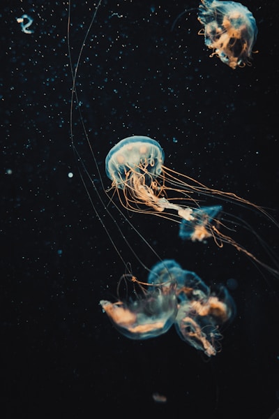
Default
Auto-rotating image slides. Each item needs src and alt.
Reverse & tilt
reverse flips the spin direction; tilt angles the whole scene.
Interactive
interactive enables keyboard focus and the item-click event.
Click a card (interactive mode)
Custom slot
Use the #item scoped slot to render any card content instead of an image.
Strategy
Design
Build
Launch
Scale
API Reference
Props, events, and slots for each sub-component.
Carousel3d
Props
| Prop | Type | Default | Description |
|---|---|---|---|
| items | Carousel3dItem[] | [] | Slide objects with at least src and alt. |
| cardWidth | string | "clamp(10em, 35vw, 17.5em)" | CSS width of each card. |
| cardAspect | string | "7 / 10" | CSS aspect-ratio of each card. |
| cardRadius | string | "1.5em" | Corner radius of each card. |
| gap | string | "0.5em" | Gap between cards. |
| perspective | string | "35em" | CSS perspective distance for the 3D scene. |
| tilt | string | "0deg" | Scene tilt angle. |
| duration | string | "32s" | Full rotation duration. |
| animated | boolean | true | Auto-rotate. Supports v-model:animated. |
| reverse | boolean | false | Reverse rotation direction. |
| pauseOnHover | boolean | false | Pause rotation while hovered. |
| clickToToggle | boolean | true | Click a card to pause/resume. |
| interactive | boolean | false | Enable keyboard focus and item-click events. |
| fadeEdges | boolean | true | Fade cards near the scene edges. |
| showShadow | boolean | false | Render a soft ground shadow. |
| imageLoading | "lazy" | "eager" | "lazy" | Native loading attribute for card images. |
| ariaLabel | string | "3D rotating carousel" | aria-label for the carousel region. |
Events
| Event | Description |
|---|---|
| item-click | Fires when a card is clicked (interactive mode). Receives (item, index, event). |
| update:animated | Fires when rotation pauses or resumes. Enables v-model:animated. |
Slots
| Slot | Description |
|---|---|
| item | Scoped slot to render each card. Receives { item, index }. Defaults to an image. |
| empty | Rendered when items is empty. |